
Role: User Research and Design Tools: Illustrator Methods: SWOT & Competitive Analysis
Problem
For this project, we were asked to help insured members understand what they’ve paid and what they owe, regardless of the method of payment used to settle co-pays or pay toward their deductibles.
Research and Insights
To gain a better understanding of this space, we conducted interviews, created surveys and looked for other data points to identify issues are were critically important to insured members. When we reviewed the data, we found three main concerns that people with insurance felt were noticeably lacking in their healthcare experience.
- Clarity - What does my plan include?
- Consistency - When will I be notified that out-of-pocket costs are required?
- Costs - What was covered by my insurance? What do I owe and how much have I paid toward my deductible?
In addition to understanding these pain points, we thought it was important to better understand what questions occurred for insured members from beginning to end. Once we were able to visualize their experience, we set out to identify design requirements that would enable us to deliver critically important information to members when they need it most.
As we reviewed insights from our interviews we found that members care about where their money is going and they understand that they have a role to play in the healthcare ecosystem. For this reason, we decided to focus on building an in-app experience that provides users with intuitive interactions, real time access to account details, medical professionals, and knowledgeable support specialist if they have questions about their health plan. As we moved into the concepting phase, we understood that our design would only add value if the interface was simple, and if our principle focus was on delivering clear, concise and actionable information to their members.
Concepts and Design Outcome
Clarity, consistency and cost kept coming up during the concepting concepting phase, so as we moved forward, they served as a major influence the direction that we took during this project.
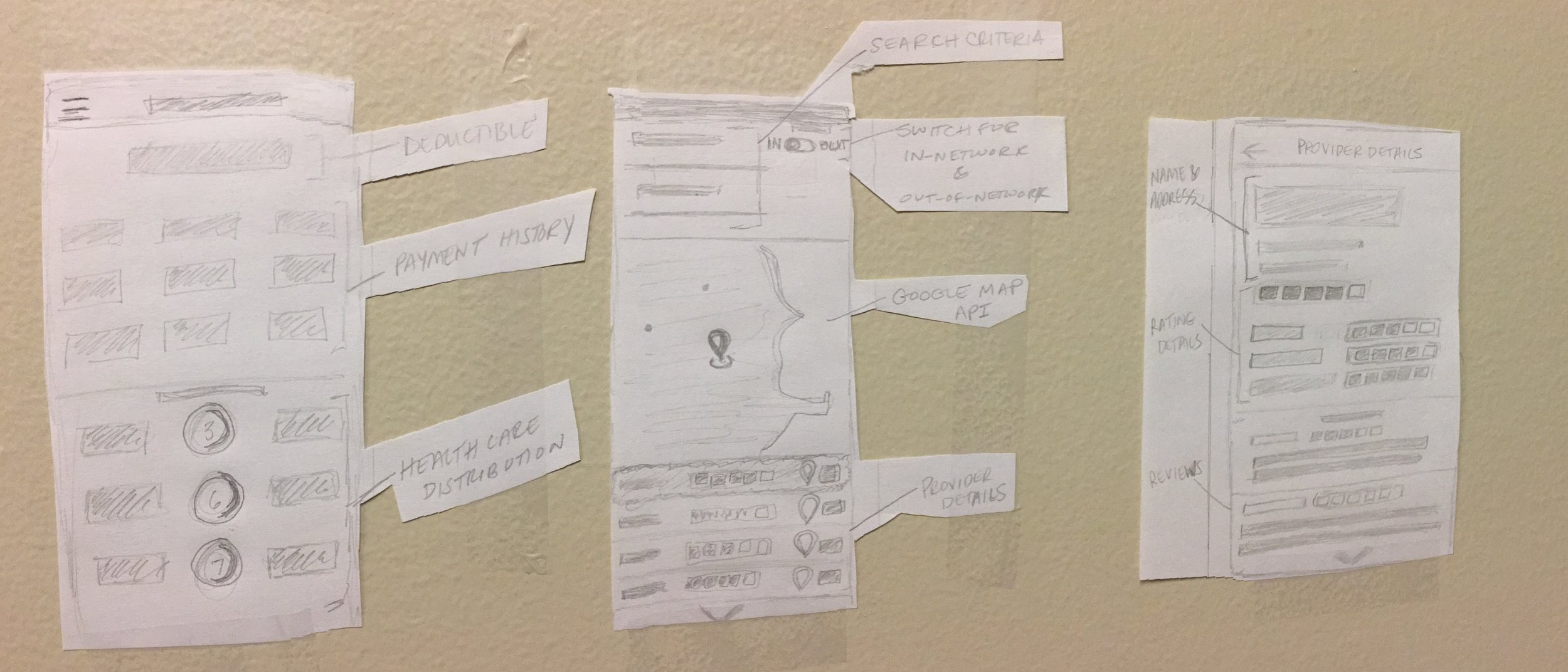
Early sketches of the account details, find a doctor, and provider details pages.
After several rounds of sketching, reflecting and critiquing, we created an experience that would make it easy for members to understand billing and payment activity, a breakdown of their health care use, and information about their deductible. Below I have included a few images of the final designs that we presented to our client as well as a brief rationale for key features.
The Account Details screen provides members with clear, concise and actionable information at a glance.
The Find a Doctor screen provides members with access to all medical service providers by location and allows to evaluate each option before choosing to see a doctor.
The Provider Details view allows members to view ratings and reviews of medical service providers.
Additionally, we added scanning functionality via the Scan Receipt feature to allow members to capture scan receipts to ensure accurate bookkeeping and payment tracking.
The Pay screen allows members to make in-app payments that will be updated immediately on the Account Details screen.
Additionally, given that we were asked to help members track their payments, our design also included notification options to inform members of key updates in real-time.
Please Note: While some aspects of this project were anonymized or not included, I can discuss them in greater specificity in an interview.